Wednesday, May 6, 2009

What does your card say about your company?


Whenever I present to a client concepts the first thing I say is that I believe that design doesn't need to be explained. Now of course, I always have rationales for everything I have done. And I always talk about them, because that's part of the job. But the truth is that good design should communicate your message without the designer needing to speak a word. If an idea isn't understood, than it's not working. As designers we're problem solvers. And we use words and pictures to solve those problems. What's important is not what we tell you a concept means, but what your reaction is. Because if you don't have a reaction, then how can one of your clients? Your materials need to be understood so that when you're not around, they're conveying your message, your brand. Case in point: I received these cards yesterday from a client that I have just branded. A professional organizer. And what I really love is not only did she pull out her card, but a card of a competitor. With so much information crammed into a tiny space, with images all over the place, it was clear that we succeeded in conveying her goals. To create a space that works. a space you love.

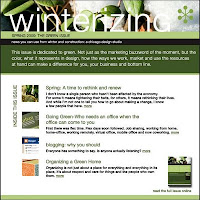
Newsletters-what they may look like


Every day I get the Hungry Girl email. Right now I'm thinking it's a bit to much, so I will probably unsubsribe. Something to consider when sending out mass emails. The other issue, which I mentioned on the previous posting, is how they may appear on different email systems.

Tuesday, May 5, 2009

Bit of a control freak


Today I sent out my second newsletter. And while my first thought was to use a service such as constant contact, I wanted control over the design. The problem is, that you can't send out pdfs using the service. What they offer is html with the ability to customize and add images. And while I tested the service out, the problem is that you can't control all the different email clients and the way that they're viewed. So what did I do? Just like I would for a client, I needed to come up with a solution. For me, it was important that it appeared a certain way. Also, I wanted to give a brief overview of what was in the newsletter. So while the original is posted on my site, the email version had links. A second piece was created, a gif, that allowed for the best image options while still keeping it under the required size.